Thursday, August 28, 2014

Miniatures Kickstarter: Bruce Lee! Dragon Tides!

Photo taken from the Dragon Tides Kickstarter. 
Well this one was a pleasant surprise. It's called Dragon Tides. Look at those sweet-ass figures! Bruce Lee! Brandon Lee! Based on real-life martial artists! Officially licensed by the Lee family! Look at all of those exclamation marks!

Alexander Lim, the project creator says the figures are about 35-40mm (but that includes the base, so probably about 32-37mm heroic sized), which I personally love because they are much easier to paint.

On the KS page, there is also a video on basic gameplay mechanics (I haven't watched it yet.)
There is also a solo mode, which bodes well for me (my friends don't play many minis games.)

Anyway, head on over, check it out, see how you like it! Exclamation marks!!!


Sunday, August 24, 2014

Do you want some Ghostbuster miniatures?


... Well you sure as hell can't have any of my little homemade gems. But Crooked Dice Games will be releasing some lovely little figures in September! Here's a link to photos on their Facebook page.

Photo by Crooked Dice Game Design Studio
I haven't added to my collection in a long time; I think the last thing I still have on my want list is a proper Ecto-1 in 1/43 scale (which exists -- I'm just looking for a good price.)

So I'll probably pass up on these figures since I already have a crew, but I may go for some of the extra equipment; I wouldn't mind having some proper-looking ghost traps ... and maybe a new Slimer.

Next week will end with some fun: It's the 30th anniversary of Ghostbusters, and our local theater (as well as others nationwide) will be showing Ghostbusters for a full week -- five shows a night! I hope you all are lucky enough to have showings in your town.

Monday, August 18, 2014

Hairy spider


This is a technique I learned from a White Dwarf article a few years ago: Using static grass as fur.
I took it in a slightly different direction using it to add hair to my spider. (This is a second copy of the spider from the Mice and Mystics game, which I highly recommend.)

The trick is to not use too much; I think I overdid it a touch with this spider. The original article used this technique on wolves, which had the fur all over. But for a spider, you just want to place the grass in key locations: leg joints, back of the thorax, abdomen. For the abdomen, I try to get two thin parallel lines running front to back.

I use superglue to stick the static grass to the figure. Use a toothpick to apply a tiny dot (or strip) of glue in the areas to be hairy. Coat your spider in static grass and shake away the excess. Prime and paint as usual. It's really that easy, and I bet most of you have everything you need. Reaper Bones spiders are nice, cheap figures you can try this technique on.

Since this is a hairy spider, I didn't do any patterns: Patterns are difficult to paint on the hair (and make look right,) but also, I just wanted the hair to be the focus of this figure.

Saturday, August 16, 2014

Vallejo flesh palette

So I think I've settled on a flesh palette using my Vallejo paints. This isn't necessarily arranged as a triad or a recipe. What I've done here is to show a few colors in order than can be layered over each other to create your own triads.

For example, for a simple cauacasian flesh tone, you could choose either Beige Brown or Brown Sand as your base shade, then follow that up with either Beige Red or Med. Flesh, and finally a highlight of Sunny or Basic Skintone. Or you could start with a base of Beige Red followed  by Flat Flesh and Basic Skintone.
The point being that these colors work with one another decently, and by varying your triads, you can vary the composition of your army's faces.

I've also put together a basic African and Indian palette. I kept these palettes simple because I think they are easier to put together. Just about any brown will work nicely. What makes caucasian difficult to recreate is that it's such a fussy combination of red, yellow, white and a tiny bit of blue without making it too red or too orange or gray. The you have to account for tanning skin or sun burn.

This is a very muted palette, lacking much with any red in it. This is why I added the Beige Red to the palette; it provides just enough blood under the skin to give the miniatures a bit of life. You could also, of course, mix any of these colors, light or dark, together to make an endless list of colors. But if you don't like to mix (and I don't), try out these colors.

Notes: 

-- My scanner didn't capture the colors exactly, but I listed the name and number of the swatch next to the color. The Sunny and Basic Skintone swatches, for example, are lighter and less "yellow" than they appear above.
-- Flat Earth actually has a bit of green in it. I think it actually works, and, as a base, also serves to gently compliment Red Leather and Light Brown. Experiment on your own; Vallejo has a lot of browns that work well.
-- The Basic and Sunny Skintones are much lighter in person -- the Basic being almost white when painted on. So use these sparingly, mostly as simple glints of light reflected off of skin (tip of the nose, a thin stripe on the top of each cheek, maybe over the eye brows.)
-- Asian skin is actually very similar to caucasian. But but if you want some differentiation, use either Beige Brown, Brown Sand or Medium Flesh as your base, staying away from the Beige Red (or any other reddish tones.)

Thursday, August 14, 2014

Skin and bones


While Jeff, that lucky sonofabitch, and thousands of others are enjoying GenCon this weekend, I'm stuck with a 60-hour work week. Still, I manage to find time to paint minis late, late at night. But I don't have many of my own right now (still a few Zombicide figures, though,) so I finished up a small, diverse group of Bones figures for Jeff. Nothing of note here. I kept things simple. The goblins were painted in the different bright colors for easy identification in the battlefield; this is a standing order from Jeff on all the minion figures I paint for him.

(Note: I speak about Jeff every once in a while on this blog; for those who don't know who Jeff is, he is essentially my patron, paying me lots of money to paint up his mountain of figures. He also keeps me supplied with plenty of flock, bases, paints and greenstuff. So, even though he is off enjoying the nerd paradise in Indiana, I don't mind painting some of his figures this week. He's also a good friend.)

Flesh Tones

Left arm done in "rose" colors.
Right arm is done in light browns
with flesh tone highlights.
So, as I transition away from the Foundry paints, I find myself looking for a new caucasian flesh triad/recipe. The Foundry colors are still my favorite (Flesh No. 5.) It gives a nice warm, almost comic-book bright skin tone. I love it; it looks great on the table.

Still, I would like to transition to something a tiny bit more muted and more realistic. So I'm trying to find a good combo using Valljo Model color, and it's proving to be difficult. Vallejo has some decent lighter skin tones, but lacks a decent base color to start them off.

There are also some of the "rose" colors -- Rose Brown, Salmon Rose and Light Flesh, which seems to have a tiny bit of rose in it. These colors work well together but seem much to pink to work as a flesh triad. The result reminds me of old GW Slaneesh skin tones. So the rose colors are out of the running.

Some of the flesh colors I'm using, but over a base of
Orange-brown, which seems to work OK for a more
dramatic lighted effect. The colors look fantastic at distance.
Here are the colors I'm using for now. The pairings are not mixes, they're just a couple colors that work as a base shade or the highlight. They are listed from base shades to highlights:
Brown Sand/Beige Red, Medium Flesh Tone/Flat Flesh, Sunny Skin Tone/Basic Skin Tone.

I'll keep working with them. I don't think I'll find a definitive triad that will be my standard, but it's probably better this way, resulting in a bunch of variations of skin tone.

Thursday, August 7, 2014

Zombicide: Color coding Z types

I got a request to show the different zombie types to illustrate my color scheme.
The base colors denote the type of zombie (standard, berserker and toxic.)

For the subsets (walker, runner, fatty,) I only needed to make one change; I added a ring of red color around the runners' bases. I figured the difference between walkers and fatties (and abominations) was enough that I didn't need to add anything for differentiation.

The figure with the white ring is a tentative idea to identify VIP zombies, though I may go with a new idea which will be to add blood to the VIP zombies. Then I can use the white rings for another idea as explained below.

In gameplay, the red-ringed bases seems to be plenty to readily identify the runners, so I will stick with that system. For skinner zombies, I may just paint them gray just like a standard zombie, but give them the white ring. This way, I'll have the option to use the skinner zombies as either standard grays or as skinners.
The seekers will simply get a new base color (which I haven't decided on yet.)

Monday, August 4, 2014

Zombicide: General notes on monochromatic

The first five. I took my time with these, maybe about an hour total.
I've noticed a few of you wanting to paint your zombies using the monochromatic style. I just have a couple notes to add: The first five that I painted, I took my time on, imagining the colors and their gray equivalents, and took my time to brush on the paint. Those first five came out great.
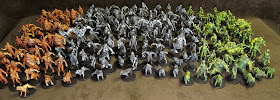
... And the remaining 200 figures only took 4 to 6 hours.
But the remaining 200 zombies, I mostly drybrushed, roughly  picking out details here and there (faces, white shirts, black ties) with a smaller brush. It's difficult to see in the horde photo, but the quality of paint is not as good as my original prototypes. BUT, all together, the effect is still the same; that wave of gray zombies still has the effect of a retro zombie apocalypse movie (not that Romero ever had herds and hordes as big as those seen in Walking Dead and World War Z), but with the monochrome, they seem to almost glow as a massive collective.

My first (and still favorite) monochromatic project. Copplestone gangsters.
I just wanted to bring this up in case you're painting your monochromatic zombies, and they're not looking as good as you had hoped. Keep it up -- the effect is not meant for individual figures, but for the crowd in its entirety. You can still take your time painting each individual zombie (and I think the look really is rewarded when you exercise patience), but slow or fast, the point is to enjoy what you're doing.

Adding color

If you want to see a black and white collection that was painted with love and patience, I recommend you take a look at this beautiful WWI collection at Analogue Hobbies. As well as painting everything in the monochrome style, Curt has picked out leader figures by adding a little bit of color, painting keppies with a slightly muted red for the French, for example.
If you add color, I recommend muting that color so that it fits the general scheme. Now, of course, it's difficult to mute a good "blood" color, so take this advice with a grain of salt; if the blood looks best bright, glossy and oozing, by all means, leave it as so.

I plan on doing my VIP zombies in grayscale, but to differentiate them from the standard grays, I will be adding blood. I'm not sure if I'll go mute or bold, though.

A little battle report
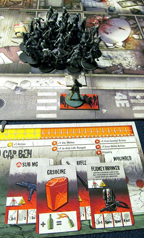
Just before the final action of the game.
Yes, the walkers are all in one room.
I played a quick solo game, playing the mission, "Under Siege" (C2.) I had Red Cap Ben, Padre Johnson, Gary and Ralph (I call this group my "Hobo Strike Force.")

I used the Romero deck to keep things somewhat sane. Even still, it got out of hand fast. just a few turns in, I lost the Padre, Ralph and Gary in consecutive turns. (I know, game over, but I wanted to see how long Ben could go.)

Before Gary bit the dust, he managed to clear an adjacent room with his submachine gun, giving Ben an escape path. Ben was able to stay just ahead of the growing hordes, though, once the spawning ended, he was able to gain some space after a little bit of running around. Finally he got a chance to search a room and found a nice present-- and he already had the gasoline.

Yes, in the photo, all of those zombies are in one room. This is just before the last action of the game. (Yes, technically the survivors lost, but Ben still had fun.)

Even though I lost, I think the game was a bit tilted in my favor; the mission is meant to be played with more spawn cards than the Romero deck (mine is about 25 cards.) I'll wait until I get a group of 5 or 6 before tackling this one again.